The Influence of Adrian Frutiger as a Typographer
Adrian Frutiger created many widely used fonts that many of us encounter in daily life. For example, in the 70s Frutiger
was asked by Paul Andreu to design a signage face for the Charles-de-Gaulle airport in Paris-Roissy. His signage design
was intended to be read with absolute clarity and zero room for error. The letters were stripped down to their bare
elements with simple uppercase and lowercase letters left behind to preserve the word images. His final typeface was
named Roissy after the location of the airport; it was later adapted into Frutiger for print. Frutiger can now be seen
in many modern-day airports because of its practical
readability. 6
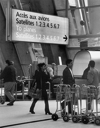
Charles-de-Gaulle signage in Roissy (1972). From Adrian Frutiger – Typefaces : The Complete Works by Osterer and Stamm.6 p. 225.
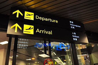
Unknown airport signage in Frutiger (2020). From Pinterest by Angus McLean.5
Much like Roissy, Frutiger’s fonts have all been developed with functionality and legibility in mind. Univers, Frutiger, Avenir, and all his other work revolutionized font design by making characters that were “readable not only to the human eye, but also to mechanical ones” 6. He was a pivotal influence in the shift from hot metal to photocomposition to digital typesetting. Additionally, Frutiger, supported by Charles Peignot created the first typeface family that was coordinated and had a consistent array of weights and widths. Univers, designed with modern demands in mind, was organized via a numerical system into 21 different variations. This was a huge advancement for the time and made Univers uniquely comprehensive compared to other typeface families. 6, 7
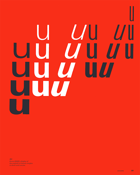
Display of the original 21 Universe weights. From Adrian Frutiger – Typefaces : The Complete Works by Osterer and Stamm. 6 p. 89.