Adrian Frutiger’s Most Significant Contribution to Typography
Adrian Frutiger has contributed so much to the field of typography, but by far his most influential work is the design of the Univers typeface family. 6
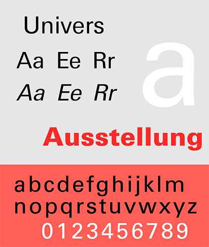
Univers typeface sample. From Univers Sample 2015, by Blythwood, 2015, Wikimedia Commons.1
Univers, developed by Frutiger in the 1950s, was designed to reflect the contemporary ideals of an evolving world while helping bring Europe into the modern age. Much like its namesake, it was designed to be adaptable and could be used for many different applications. Its clarity and balanced proportions allowed it to function effectively across a wide range of contexts, from large scale signage to dense body text its visual harmony would remain. This flexibility meant designers could rely on a single typeface to meet diverse communication needs, as said by Emil Ruder “The possibilities of Univers are such that the typographer no longer needs to look for solutions outside of typography.”6, 7
All 21 variants were designed as a unified system from the start. This approach ensured a high level of consistency across weights and styles, allowing each variation to relate harmoniously to the others. Instead of treating each style as a separate design, Frutiger developed Univers as an interconnected family, where changes in weight and width followed a logical–
and carefully controlled structure. This system made it easier for designers to create clear hierarchies and balanced compositions, while maintaining a cohesive visual identity across different uses.3, 6, 7
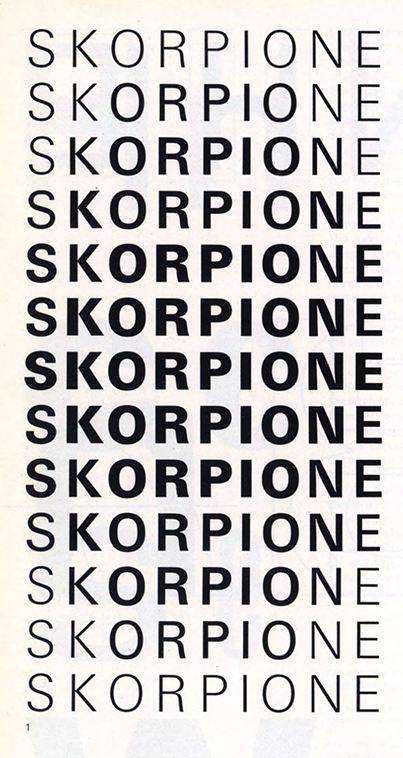
Examples of the unity of Univers as a typeface family. From Type, Sign, Symbol by Adrian Frutiger et al.3p. 22.