Analysis of Univers
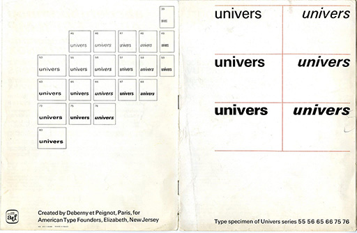
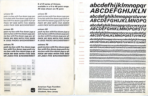
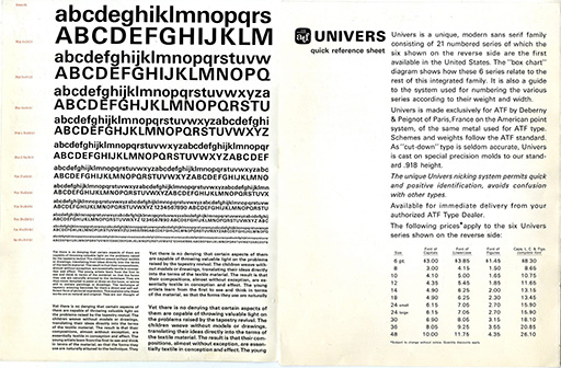
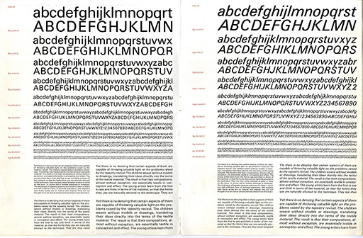
Univers type specimen sheets. From Univers Type Specimen Sheets Designed in 1957 by Adrian Frutiger by Graham Smith, Smithographics. 8
The 21 variations of Univers are:
- 39 - Thin Ultra Condensed
- 45 - Light
- 46 - Light Oblique
- 47 - Light Condensed
- 48 - Light Condensed Oblique
- 49 - Ultra Condensed
- 53 - Medium Extended
- 55 - Medium
- 56 - Medium Oblique
- 57 - Medium Condensed
- 58 - Medium Condensed Oblique
- 59 - Medium Ultra Condensed
- 63 - Bold Extended
- 65 - Bold
- 66 - Bold Oblique
- 67 - Bold Condensed
- 68 - Bold Condensed Oblique
- 73 - Black Extended
- 75 - Black
- 76 - Black Oblique
- 83 - Extra Black Extended 8
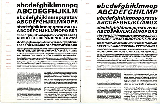
Univers is a Neo-grotesque font, differing from its predecessor Grotesque because of its consistency and simplicity. While grotesque fonts tend to be a little bizarre and exaggerated in their thick and thin contrasts, Univers’s shapes tend to be more proportionate. Additionally, Univers is unmistakably missing a spur on its uppercase G, and the lowercase counterpart is missing a secondary loop, making it single-story. The contrast in Univers is also noticeably less so than Grotesque fonts, making it clear its the classification of Neo-grotesque.4
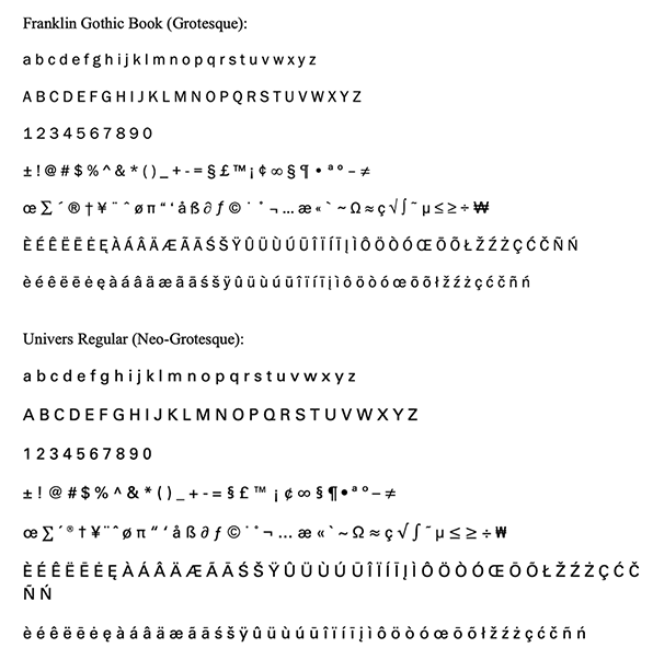
Notice how even the characters of Univers are compared to Franklin Gothic; this is a clear example of Adrian Frutiger's thoroughness in the process of designing the Univers typeface family. The widths and styling of letters remain consistent; unlike Grotesque typefaces Univers has been refined down to beautiful simplicity lacking any of Franklin Gothic’s unusual flair’s— such as the spur that extends from where the curved bowl meets the vertical stem on its lowercase b, its shape unusual in the way it varies from the other characters.
The differing levels of contrast are especially visible when inspecting the numerical characters. Univers lacks the variation of line weight that Franklin Gothic possesses. For example, on the character 2 in Franklin Gothic the width expands along the top of the bowl and compresses continuously towards the baseline stroke. This feature is not present in Univers and the numerical characters widths remain constant. Univers is therefore defined by its uniformity, where consistency in form and weight replaces the expressive irregularities of earlier grotesque typefaces, resulting in a more balanced, legible, and systematically structured approach to typography.